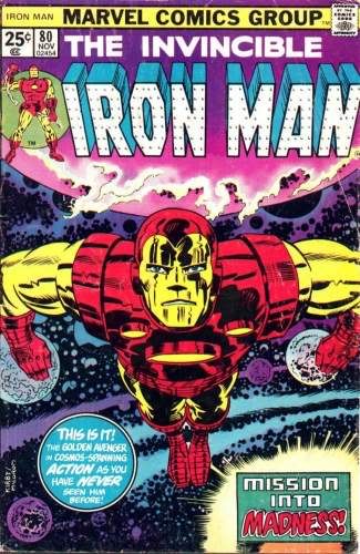
Inked by Al Milgrom. Solid enough job, and some nice stuff in the background space scene, but I have to say, this may be the most boring Kirby cover of all time. There are only a handful of Kirby covers I can think of where the character isn't doing anything, and this may be the most dull of them. I think it's the almost symmetrical pose that really does it.
On the other hand, you see covers like this almost every week on books published now.

Published November 1975


1 comment:
Bob,
I have to disagree with you on this one. That cover jumped off the racks when it came out! It was a simple, powerful image, with an almost 3-D Iron-Man. One of the problems with many of the 1970s (IMO) is that they were too cluttered and busy. I wouldn't want a steady diet of this type of cover, but a poster-style effect was nice every once in a while.
Nick Caputo
Post a Comment