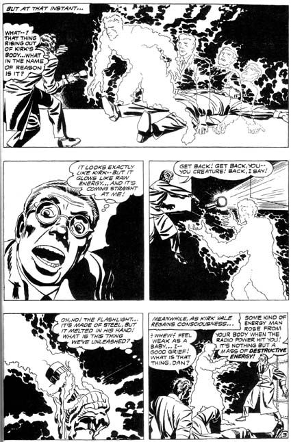
In this story, two scientists build a miniature town to test their power transmission through radio waves device. A loose watch straps makes all the energy go through one of the men, creating a negative energy duplicate of him.

The negative being goes on a rampage, until the original scientist plans to sacrifice himself to destroy it. Fortunately for him, what he didn't know was the secret of the negative being which made it afraid of him.
I really like what I've read of the Kirby stories from DC in this period, and it looks really sharp in this book (except for the enlarged gutters they would put in reprints back in the early 1970s). That first panel in the scan is just really evocative and does a great job of capturing movement on a comic page.
Great book overall, too, maybe my favourite book in DC's new SHOWCASE PRESENTS line so far, thanks to the sheer variety of great artists from that era, with much better reproduction than the stories got the first time around.
Published 2006


3 comments:
So what was the story on those enlarged gutters, anyhow?
Older comics were a bit wider (but the same height) than they were in the 1970s, and DC also used to run a banner across the top of the pages with the book title and the DC logo on either end until the mid-1960s, so I guess they figured people would feel ripped off if they ran the art as it was originally, leading to big top and bottom margins (same way some people apparently didn't like letterboxed movies on their TVs). Sometimes they just added a new banner (the Kubert edited war books did that), sometimes they altered the art, sometimes just added gutter space. It's not too bad when the art was a basic grid pattern, but it's really distracting on the old S&K stuff where they used circular panels and characters overlapping panels.
Thanks for the explanation. At least there seems to be some thought towards the reader, as opposed to just reprinting it. Someone evidently had to physically cut apart the artwork and paste it up with wider margins.
Post a Comment