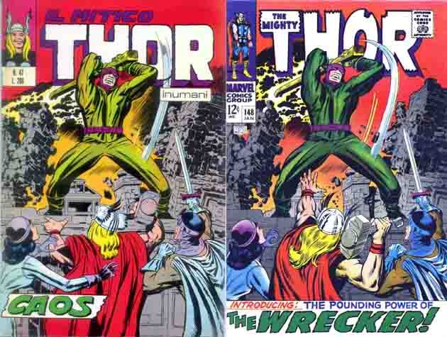
Yes, it's another one of those where we can all stand mystified that the re-drawing was deemed necessary, or even worth the time. No agreement on who did the modifications. The Kirby checklist lists Marie Severin, Nick is thinking Romita/Verpoorten.
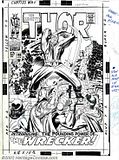
And thanks to commenter Greg for mentioning that the original was auctioned a few years ago. Click for a big scan of the original artwork, or visit the original auction, where you can see that this puppy sold for almost $10,000.


6 comments:
Loks like Buscema to me, probably wth Veerpoorten, at least on Thor. Sif and Balder, not so much like Buscema.
The redrawn Thor figure is more dynamic. He also looks like he's confronting the Wrecker. In the Italian version he looks like he's looking at the Wrecker's right foot.
For another example of an altered Kirby cover, the Red Skull has different heads on the covers of Captain America #101 and Marvel Super Action #2, which reprinted that issue. www.milehighcomics.com has an image of the latter cover. The head on the reprint looks like the Kirby/Shores Skull; I'd guess the head on the original was toned down for Code reasons.
Luke Blanchard.
Nick Caputo here! I saw the original art on line some time ago as well, and you can see the directions on the right hand side that says: "Stat and move up". I was bugged by this cover for many years, always wondering what Kirby's unaltered cover looked like and why it was changed (I thought perhaps Kirby had drawn Don Blake where Thor was). I was thrilled to discover the original version was actually out there, printed in Italy, when my buddy Guiseppi Guidi sent it to me! I like Kirby's "quieter" version, since the presence of the Wrecker is dynamic enough, IMO.
Nick Caputo
In the Italian version, is the area at the bottom of the page, corresponding to the blurb on the US cover, an addition by another artist to Kirby's drawing?
Looking at the larger scan I have of the Italian cover, it looks like the art was extended by another artist, not original Kirby/Colletta art that's under the title blurb.
Thanks.
Luke Blanchard
Post a Comment